SaaS Landing Page: Structure, Examples & Templates (2026)
What a SaaS landing page is, the 12-block structure that converts, real examples you can copy, realistic conversion benchmarks, and a step-by-step build and tracking guide for 2026.
- 01What is a SaaS landing page?
- 02The anatomy of a high-converting SaaS landing page
- 03SaaS landing page examples worth studying
- 04Copywriting formulas for the hero section
- 05Conversion rates: what should you expect?
- 06How to build a SaaS landing page step by step
- 07Tracking and measurement
- 08A/B testing without fooling yourself
- 09Templates and tools
- 10SEO for SaaS landing pages
- 11Common mistakes
- 12Mobile and speed checklist
- 13The bottom line
We'll email you our Performance Marketing Setup Checklist instantly.
No spam. Unsubscribe anytime.
A SaaS landing page is where paid traffic either turns into revenue or quietly disappears. You can run excellent campaigns into a weak page and lose money all month — which is why landing pages are a core performance marketing skill, not a design afterthought.
This guide covers what a SaaS landing page actually is, the block-by-block structure that converts, examples of patterns you can copy, how to build one step by step, and how to measure it so improvements are based on data instead of opinion.
What is a SaaS landing page?
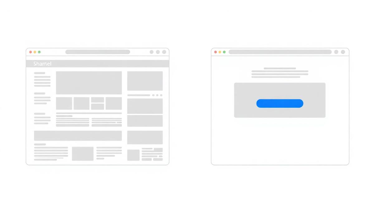
A SaaS landing page is a single, focused page built to convert one specific visitor into one specific action — a free trial, a demo request, or a signup. It is not a tour of your product, and it is not your website in miniature.
The distinction that matters:
| Homepage | Landing page | Pricing page | |
|---|---|---|---|
| Audience | Everyone | One campaign segment | Buyers comparing plans |
| Goal | Orient and route | One conversion | Plan selection |
| Navigation | Full menu | Usually removed | Full menu |
| Copy | Broad positioning | One promise, repeated | Feature-to-price mapping |
| Best traffic | Brand and direct | Ads, campaigns, launches | Late-stage visitors |
Sending cold ad traffic to a homepage is the most expensive habit in SaaS marketing. The visitor arrives with one question and gets a menu instead of an answer.
The anatomy of a high-converting SaaS landing page
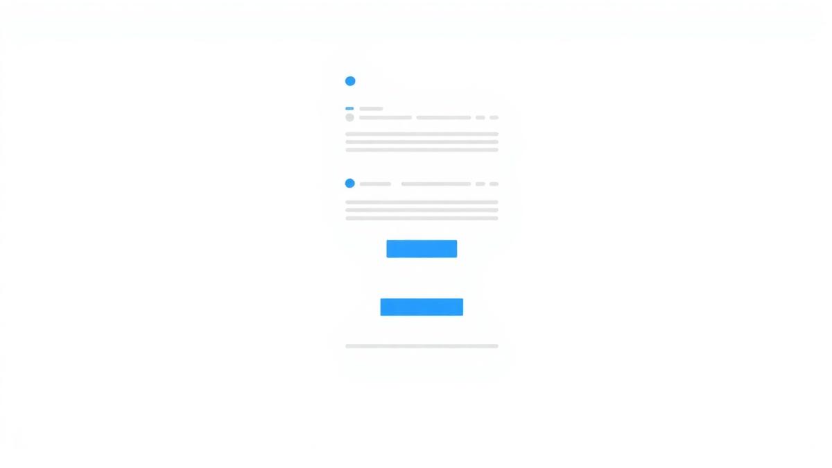
Nearly every page that converts well uses these blocks, in roughly this order.
1. Outcome headline. Say what the user gets, not what the software is. "Close your books in two days, not two weeks" beats "Cloud-based accounting automation platform".
2. Clarifying subhead. One sentence covering who it is for and how it works. The headline sells; the subhead removes confusion.
3. Primary CTA above the fold. One button, one verb, low friction. "Start free" outperforms "Submit". Ask for the minimum information you genuinely need.
4. Social proof strip. Customer logos, a rating, or a usage number placed immediately under the hero. Proof this early lowers scepticism for everything below it.
5. Problem statement. Describe the pain in the customer's own words before you describe your solution. If they nod here, they read on.
6. Product visual or demo. A real screenshot, an annotated UI shot, or a short silent loop. People buy what they can picture themselves using.
7. Benefits, not features. Convert each feature into a consequence. "Role-based permissions" becomes "Give clients access without exposing your data".
8. Use cases or personas. Three short columns so different visitor types can self-select. This is also where secondary keywords fit naturally.
9. Pricing clarity. Show the price, a starting price, or exactly what determines it. Ambiguity reads as expensive.
10. Objection handling. Migration effort, contract length, security, learning curve, whether it works with existing tools. Every unanswered doubt is a silent exit.
11. Trust and security signals. Compliance badges, uptime, data handling, support response times, refund or cancellation terms.
12. Closing CTA. Repeat the same offer with the same wording as the hero. Never introduce a new offer at the bottom.
Two rules govern all twelve: one page, one action, and every block earns the next scroll.
SaaS landing page examples worth studying
Rather than listing brands, study the four patterns that recur across well-performing SaaS pages — you can see all of them in the wild in an afternoon of browsing:
- The product-first page. Hero is almost entirely a product visual with a one-line headline. Works when the product is visually self-explanatory and the category is understood.
- The problem-first page. Opens on a painful, specific situation and only introduces the product after agreement is established. Works for new categories where nobody is searching for your solution yet.
- The proof-heavy page. Logos, numbers and case studies dominate the first two screens. Works when the buyer's main risk is "will this actually work for a company like mine?".
- The comparison page. Positions directly against a known alternative with a feature-and-price table. Works for switchers, and it captures high-intent "X vs Y" search traffic.
Pick the pattern that matches your buyer's biggest doubt. Copy the structure, never the copy.
Copywriting formulas for the hero section
Fill these in and you will have a workable headline in ten minutes:
- [Outcome] without [the usual pain]. — "Ship reports without touching a spreadsheet."
- The [category] for [specific audience]. — "The CRM for two-person agencies."
- [Do the thing] in [time frame]. — "Onboard a new client in 15 minutes."
- Stop [undesirable status quo]. — "Stop reconciling invoices by hand."
- [Number] [audience] use us to [outcome]. — only if the number is real.
- From [before state] to [after state]. — "From scattered leads to one pipeline."
- [Familiar tool], but [key difference]. — a shortcut that works with switchers.
- Everything you need to [job to be done]. — safe, broad, and useful when the category is crowded.
Test the headline before anything else. It is the highest-leverage element on the page by a wide margin.
Conversion rates: what should you expect?
Honest answer: there is no single benchmark that applies to you. Conversion rate on a SaaS landing page swings enormously with traffic source, offer size and price point. A branded-search visitor landing on a free-trial page behaves nothing like a cold Meta click landing on a demo request form.
So do this instead:
- Run two weeks of consistent traffic and record your own baseline CVR by source and device.
- Compare like with like — this month's paid search versus last month's paid search, never paid search against your organic average.
- Judge every change against that baseline, not against a number from someone else's blog post.
If you want the underlying maths for evaluating whether the campaign feeding the page is profitable, our ROAS formula guide walks through it, and the sales funnel guide shows where the landing page sits in the wider journey.
How to build a SaaS landing page step by step
- Define one audience and one offer. Trial, demo, or waitlist — choose one.
- Identify the awareness stage of the traffic you will send, and write to it.
- Wireframe the twelve blocks before opening a design tool.
- Write the copy first. Design serves the words.
- Add real product visuals — screenshots beat illustrations.
- Build it. Your own stack, a page builder, or an AI builder for speed. If you want to see this done live end to end, we run a hands-on build a website with AI session.
- Install tracking before launch (see below).
- Launch small, watch scroll depth, form drop-off and device split.
- Test one element at a time, starting with the headline.
Tracking and measurement
A landing page without tracking is a guess with a URL. Minimum viable setup:
- GA4 — events on page view, CTA click, form start and form submit. Mark the submit as a key event. (GA4 events documentation)
- Google Tag Manager — so you can add and fix tags without a deploy.
- Google Ads conversion tracking — the platform needs the conversion signal to optimise. (setup guide)
- Meta Pixel + Conversions API — browser-only tracking under-reports; the server-side API recovers a meaningful share of it. (Conversions API docs)
In week one, look at four things: conversion rate by device, form start versus form submit (the drop between them is pure friction), scroll depth to the CTA, and mobile load time.
A/B testing without fooling yourself
- Change one meaningful element at a time — headline, CTA wording, form length, proof placement.
- Test in the order of leverage: headline → offer/CTA → form → proof → layout.
- Let each variant collect enough conversions that the difference is not noise. Calling a winner on eleven conversions is a coin flip with extra steps.
- Keep a written log of what you tested and what happened. Six months of that log is worth more than any best-practice article.
Templates and tools
You do not need an expensive stack:
- Build: your existing site, a page builder, or an AI website builder for a same-day first version
- Analytics: GA4 + Google Tag Manager, both free
- Ad tracking: Google Ads conversion tracking, Meta Pixel + CAPI
- Behaviour: any heatmap/session-recording tool, useful early and then occasionally
- Copy: a swipe file of pages in your category, refreshed monthly
- Visuals: AI editing for hero and feature imagery — see our ChatGPT photo editing prompts for backgrounds, packshots and placement resizes
If you want a head start on the structure itself, our premium landing page template and AI website prompts give you the block layout and the prompts to fill it, and the website launch checklist covers everything to verify before you spend on traffic.
SEO for SaaS landing pages
Ads-only pages and search-facing pages are not the same job:
- Ads-only pages optimise purely for conversion. Keep them out of the index if they duplicate other pages.
- Search-facing pages need real depth: the query answered clearly near the top, supporting sections, internal links, and a title and description written for clicks rather than keyword density.
- Avoid thin duplicates. Twenty near-identical city or keyword pages is a pattern Google handles poorly and users hate.
- Speed and mobile are ranking and conversion factors at once. Core Web Vitals are worth fixing for both reasons.
If you are building landing pages that must also earn organic traffic, our guide on SEO and performance marketing together covers how the two feed each other.
Common mistakes
- Vague headline. If it could belong to a competitor, it is not a headline.
- No proof. Claims without evidence read as marketing noise.
- Feature dumps. Nobody buys a bullet list of capabilities.
- Competing CTAs. Two asks halve both.
- Long forms. Every extra field costs conversions. Ask for what sales genuinely needs and nothing more.
- Slow mobile pages. Most Indian traffic is mobile. A page that takes six seconds is a page nobody sees.
- No tracking. You cannot improve what you never measured.
- Message mismatch. The ad promised one thing; the page talks about another. This is the most expensive mistake on the list.
Mobile and speed checklist
- Headline, subhead and CTA all visible without scrolling on a mid-range phone
- Compressed, correctly sized images with lazy loading below the fold
- Tap targets large enough, form fields with the right mobile keyboard types
- No layout shift as the page loads
- Tested on a real phone on mobile data, not just a desktop browser at full width
The bottom line
A SaaS landing page is not a design exercise. It is one audience, one promise, one action — structured so each block earns the next scroll, and measured so you know exactly where people leave.
Get the structure right, add proof, track everything, and test the headline first. That sequence beats a redesign nearly every time.
If you want to learn landing pages, tracking and paid campaigns hands-on with live budgets and mentorship, that is exactly what we teach in our 6-week AI-powered performance marketing course — it starts with a free masterclass, and the career guide covers where these skills lead.
Glossary
- Landing Page
- A standalone page built for a single campaign and a single conversion action, usually with no site navigation.
- Hero Section
- The first screen a visitor sees: headline, subhead, primary call to action and a supporting visual.
- Above the Fold
- The part of the page visible without scrolling. On mobile this is small, so the promise and CTA must fit there.
- Message Match
- Keeping the ad's promise and the landing page headline consistent. Mismatch is the single most common cause of high bounce on paid traffic.
- Social Proof
- Evidence that others already trust you — customer logos, reviews, usage numbers, case studies, security badges.
- CVR (Conversion Rate)
- Conversions divided by visitors. On a SaaS landing page this usually means trial signups or demo requests per visit.
- CPL (Cost Per Lead)
- Ad spend divided by leads generated. The main efficiency metric for demo-request and trial pages.
- Awareness Stage
- How much a visitor already knows about their problem and your solution — unaware, problem-aware, solution-aware, product-aware or most aware.
- A/B Test
- Splitting traffic between two versions of a page to see which converts better, changing one meaningful element at a time.
Sources & Further Reading
Frequently Asked Questions
What is a SaaS landing page?+
A SaaS landing page is a standalone page designed to convert a specific visitor into a free trial, demo request or signup for a software product. It has one audience, one promise and one call to action, and usually removes site navigation so nothing competes with that action.
What is the difference between a SaaS landing page and a homepage?+
A homepage serves everyone — customers, job seekers, investors, existing users — so it links out in a dozen directions. A landing page serves one campaign and one visitor type, and every element on it exists to drive a single conversion. That is why paid traffic should almost never point at a homepage.
What should a SaaS landing page include?+
At minimum: an outcome-led headline, a clarifying subhead, a primary CTA above the fold, a product visual, social proof, a problem statement, benefits framed as outcomes, use cases, pricing clarity, objection handling, trust and security signals, and a closing CTA.
What is a good conversion rate for a SaaS landing page?+
It depends heavily on traffic source and offer. Free-trial pages fed by high-intent branded or search traffic typically convert far better than cold social traffic, and demo-request pages convert lower than self-serve signups because the ask is bigger. Rather than chasing an industry average, set your own baseline in the first two weeks and improve against it.
How long should a SaaS landing page be?+
As long as it takes to answer every objection a buyer has, and no longer. Simple, low-commitment offers (free tools, waitlists) work short. Expensive or unfamiliar products need length because more doubt has to be handled before someone acts.
Should a SaaS landing page show pricing?+
For self-serve products, yes — hiding pricing filters out serious buyers and wastes ad spend. For enterprise or custom-priced products, show a starting point, a range, or a clear explanation of what determines price rather than a blank page.
Do I need a separate landing page for each ad campaign?+
For each distinct audience or promise, yes. You do not need a new page per keyword, but if the ad says something the page does not immediately repeat, you lose the click you just paid for.
What tools can I use to build a SaaS landing page?+
Your own website stack, a dedicated page builder, or an AI website builder if you need a first version fast. The build tool matters much less than the structure, the copy and whether conversion tracking is set up correctly.
How do I track conversions on a landing page?+
Install GA4 with events on form start and form submit, add Google Ads conversion tracking for paid search, and add the Meta Pixel with the Conversions API for social traffic. Verify the events fire on a real submission before you spend money.
What is the fastest way to improve a landing page that is not converting?+
Check message match first — does the page repeat the promise the ad made? Then check mobile load speed and form length. Those three fixes recover more lost conversions than any redesign.
Join our live training program and become a performance marketing professional.
Instant-download resources from the PMAcademy shop that pair with this guide.